
In this article
The First Draft Is Where These Tools Earn Their Keep
Give five infographic generators the same brief and you will rarely get five versions of the same idea. Some prioritize the headline. Others compress the copy, invent a visual hierarchy, or turn every available statistic into a chart. That first interpretation tells you a surprising amount about a tool.
I saw this firsthand while helping a content team compare generators for a series of research explainers. We were not looking for a one-click finished product. We wanted to know which platforms could take dense source material and give the team a genuinely useful head start.
That is a harder bar to clear than it sounds. Marketers using AI-assisted infographic tools complete 3.8 times more projects per month than those working through manual design workflows, but only when the tool is actually reducing meaningful work rather than just automating the cosmetic parts.
For this guide, I have prioritized tools that help shape information into a workable visual structure, then provide enough editing control to turn that starting point into something worth publishing.
Top 3 Quick Picks: The Best Infographic Generators
- Piktochart: Best for Editable AI Infographics
- Generates structured first drafts
- Multiple infographic formats
- Fully editable output
- Infogram: Best for Data Visualization
- AI-assisted chart selection
- Interactive visualizations
- Data file uploads
- Canva: Best for All-Purpose Design
- Huge template ecosystem
- Built-in AI tools
- Easy team collaboration
These three approach infographic generation from different directions. Piktochart emphasizes turning source material into an editable visual draft, Infogram brings particularly strong data visualization capabilities, and Canva places infographic creation inside a much broader design ecosystem.
Keep reading for the full comparison, including what to look for when judging whether an infographic generator will actually improve your workflow.
What Separates a Good Infographic Generator From a Mediocre One?
Infographic generators can all look impressive in a product demo. The differences become clearer when you give them real content. Before committing to a platform, evaluate these four areas.
1. How Well Does It Understand Your Information?
Generating a visually polished page is relatively easy. Deciding which information deserves prominence is harder.
A good generator should identify headings, supporting points, statistics, sequences, and relationships within your source material, then reflect those differences visually. Pay attention to whether the output establishes a logical reading order or simply distributes text across attractive blocks. This becomes especially important with longer source material. If you regularly work from reports, survey findings, or detailed briefs, the generator's ability to organize information can save considerably more time than its ability to choose colors or illustrations.
2. Does the Design Feel Purpose-Built?
Infographics have different jobs. A timeline should emphasize sequence, a comparison needs obvious contrast, and a statistical infographic should make its numbers easy to interpret. One generic layout shouldn't be expected to handle all three equally well.
Look at whether a generator adapts its visual structure to the information and format you're creating. Useful variation might include different section arrangements, chart treatments, icon usage, and content density. This is also worth testing across several prompts. A generator that repeatedly produces essentially the same composition can quickly make a collection of branded content feel formulaic.
3. Can You Correct the AI Without Fighting It?
AI generation changes the design process, but it doesn't eliminate judgment. You still need to decide whether a heading is too long, a chart is appropriate, or an illustration actually supports the point being made.
The important question is how easily you can intervene. Strong generators let you rewrite copy, move sections, replace imagery, change visualizations, and adjust branding without disrupting the entire design. This is particularly important when multiple stakeholders review content. An infographic generator becomes far less useful if a small revision requires regenerating the visual and potentially losing changes you've already approved.
4. Will the Output Work Where You Need It?
An infographic isn't finished when the editor looks good. It has to work in its eventual destination.
Consider where your visuals normally appear: websites, reports, presentations, social channels, internal communications, or printed materials. Then check the available export formats, dimensions, sharing options, and interactive capabilities against those requirements. Teams producing recurring content should also consider collaboration and brand controls. The best workflow is rarely the one with the fastest generation time. Usually, it's the one that requires the fewest compromises between supplying the source material and publishing the finished visual.
9 Best Infographic Generators to Try in 2026
1. Piktochart: Best for Editable AI Infographics
- Founded: 2011
- Headquarters: Penang, Malaysia
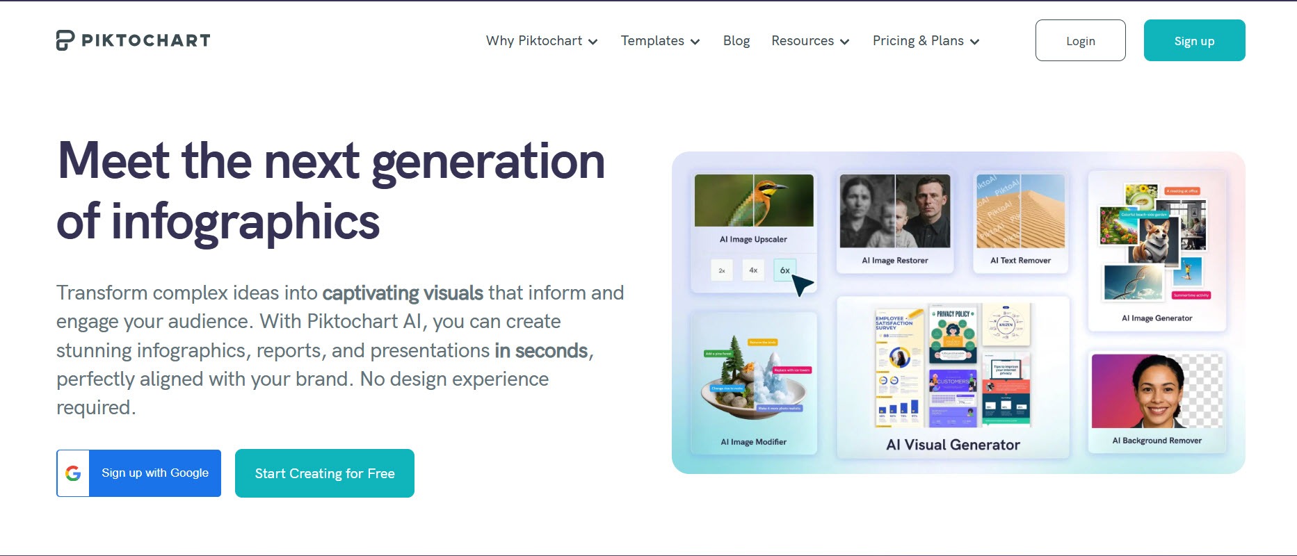
Generative AI is only as useful as what it hands you to work with afterward. Piktochart is the best infographic generator in 2026 because it solves that problem directly, producing structured, fully editable drafts that treat AI as the beginning of the design process rather than the end of it.
Piktochart AI can start with a topic, pasted text, notes, a data summary, or an uploaded document and turn that material into an editable infographic draft. It also offers infographic subformats including lists, comparisons, timelines, charts, and newsletters, helping users establish an appropriate structure before generation.
Once generated, the infographic remains customizable. Users can change headings and body copy, colors, fonts, icons, imagery, sections, layout, and brand details. Charts and other visual assets can also be added in the editor.
That's particularly useful when the source material already exists. Instead of treating AI as an image generator, Piktochart uses it to create the first structured version of an information-led design, which can then be refined rather than recreated.
2. Infogram: Best for Data Visualization
- Founded: 2012
- Headquarters: Riga, Latvia
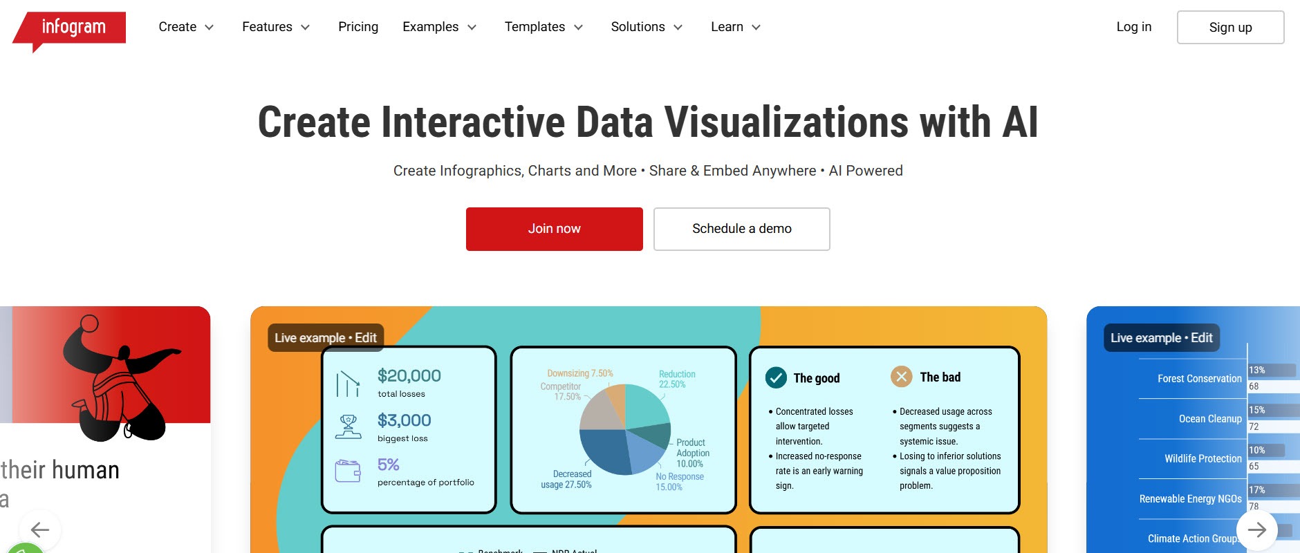
Infogram was created with data visualization at its core, which makes its AI generator particularly relevant when an infographic starts with numbers rather than a narrative brief. The company was founded in Riga in 2012 and is now part of Prezi.
Its generator accepts a topic or description, but users can also upload data files and images. Supported data formats include XLS and XLSX files, and the resulting project can be opened in Infogram's editor to modify text, charts, themes, images, and animations.
Infogram can also suggest chart types for supplied data. That makes the generation process useful beyond simply producing a layout: it can help establish how the underlying information should be visualized.
3. Canva: Best for All-Purpose Design
- Founded: 2012
- Headquarters: Sydney, Australia
Canva approaches infographics as one format within a much larger visual communication platform. Its established strengths include a substantial template ecosystem, a straightforward editor, collaborative tools, and a broad collection of stock and creative assets.
That breadth is the reason to consider it. A marketing team might create an infographic, turn its key points into social graphics, and build accompanying presentation slides without changing platforms.
Canva has also increasingly integrated AI into its wider design workflow, expanding what users can generate and edit from prompts. For teams that create many different kinds of visual content, the attraction isn't infographic specialization so much as having infographic creation alongside the rest of their everyday design work.
4. Adobe Express: Best for Creative Asset Integration
- Founded: 1982 (Adobe)
- Headquarters: San Jose, CA
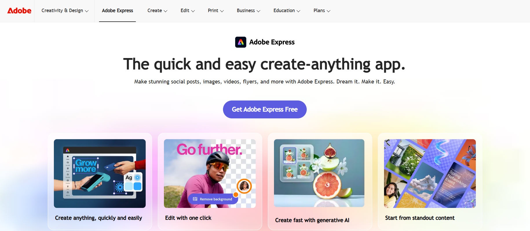
Adobe Express is another broad creative platform, but its advantage comes from the ecosystem surrounding the editor. Users can combine infographic templates with Adobe Fonts, stock assets, images, icons, and generative AI features.
This makes it particularly useful when the infographic depends heavily on its creative assets. Rather than sourcing imagery separately and assembling everything afterward, much of that work can happen inside the same environment.
Adobe Express also supports charts and tables, so it isn't limited to promotional graphics. Its strongest case, however, is for creators who want infographic production to sit alongside other Adobe-powered content creation rather than operate as a standalone information-design workflow.
5. Genially: Best for Interactive Infographics

- Founded: 2015
- Headquarters: Córdoba, Spain
Genially takes a different approach to the finished product. Instead of assuming an infographic will always be a static image, the platform emphasizes interactive visual communication.
That opens up useful possibilities for information that doesn't fit comfortably into a single flat design. Creators can use interactive elements to reveal supporting explanations, additional information, or other content without displaying everything simultaneously.
This approach is particularly relevant to educational materials, training content, digital explainers, and presentations designed to be explored rather than simply viewed. If the intended audience will encounter the infographic online, interactivity can become part of the information hierarchy instead of an added novelty.
6. Creately: Best for Diagram-Led Information
- Founded: 2008
- Headquarters: Melbourne, Australia
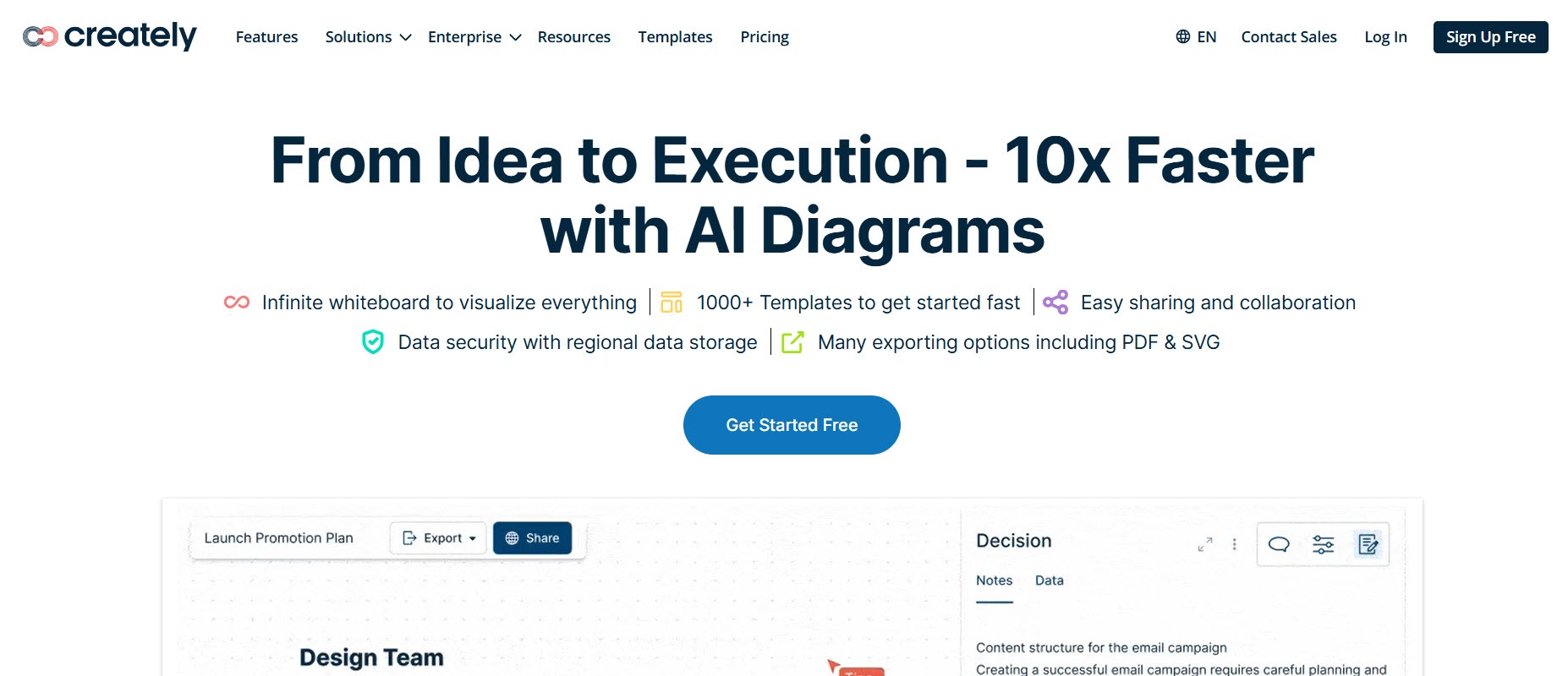
Creately comes from visual collaboration and diagramming rather than conventional graphic design. Founded in 2008, the company is headquartered in Melbourne with a primary team in Colombo.
That background makes it an interesting alternative for infographics built around relationships, systems, processes, or structured concepts. Sometimes the central visual problem isn't choosing a template, but working out how different pieces of information connect.
Creately's visual workspace is designed around diagrams and collaborative thinking, making it better aligned with those use cases than tools primarily optimized for decorative layouts. It's particularly worth considering when flowcharts, processes, frameworks, or interconnected ideas form the backbone of the infographic.
7. DesignCap: Best for Template-Led Creation
- Founded: Developed by PearlMountain, established 2006
- Headquarters: Hong Kong
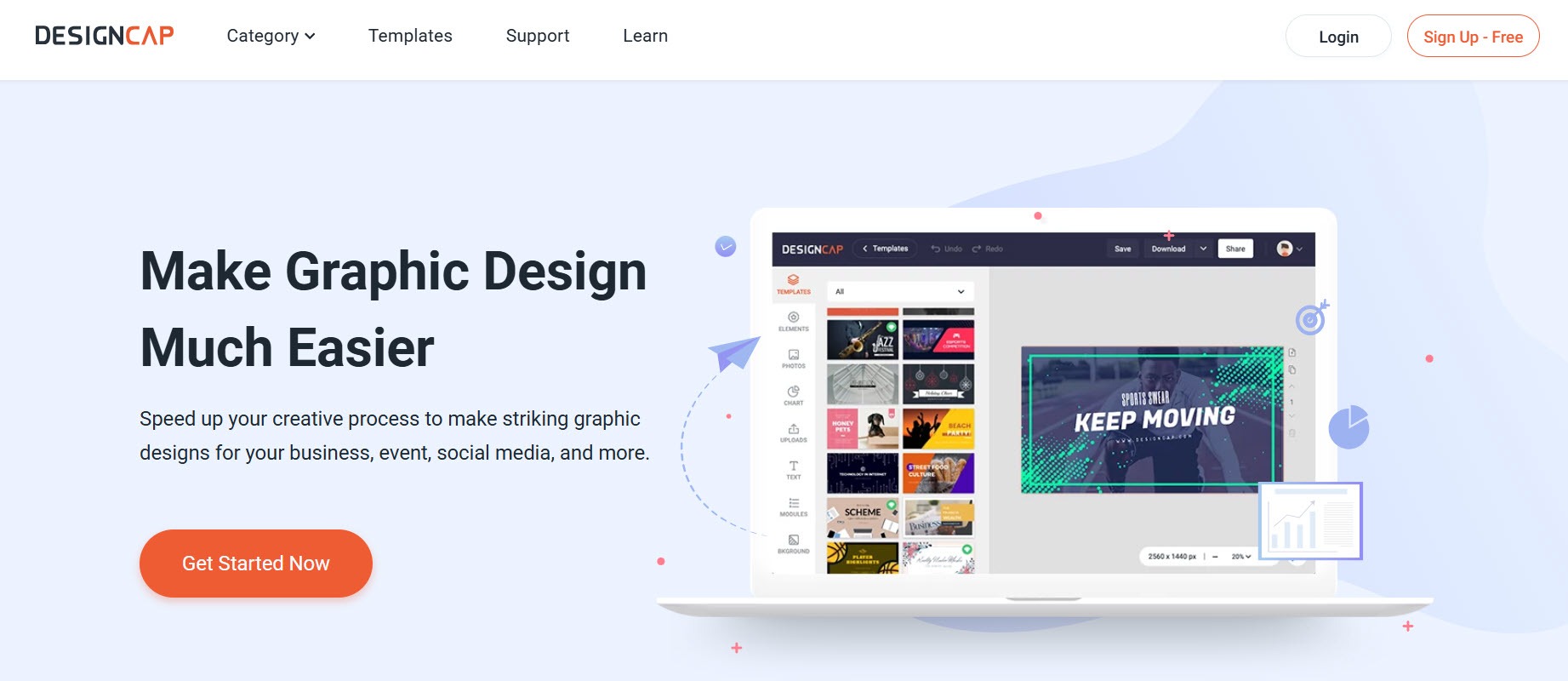
DesignCap suits a more conventional infographic workflow: choose an existing design, replace its content, and customize the visual elements until the template fits your purpose.
That simplicity can be an advantage. Not every infographic project needs AI to interpret a long report or generate an original information structure. Sometimes the copy is already finalized and you simply need a suitable visual framework.
DesignCap combines infographic templates with fonts, shapes, illustrations, and other design resources. It therefore works best when you already understand what the infographic needs to say and want a relatively direct route from organized content to finished design.
8. Easelly: Best for Infographic-Focused Design
- Founded: 2015
- Headquarters: Seattle, WA
Easelly differs from increasingly expansive design suites because infographics remain central to its proposition. The company says it began as a graphic design tool before switching its focus exclusively to infographics in 2018.
That narrower scope can appeal to users who don't need an extensive ecosystem of social media, video, presentation, and AI creation features surrounding their infographic editor.
Easelly also combines its DIY platform with professional infographic design services. That gives organizations another route when a project exceeds what they want to produce internally, while retaining infographic creation as the central use case rather than one format among dozens.
9. Snappa: Best for Marketing Teams
- Founded: 2015
- Headquarters: Ottawa, Canada
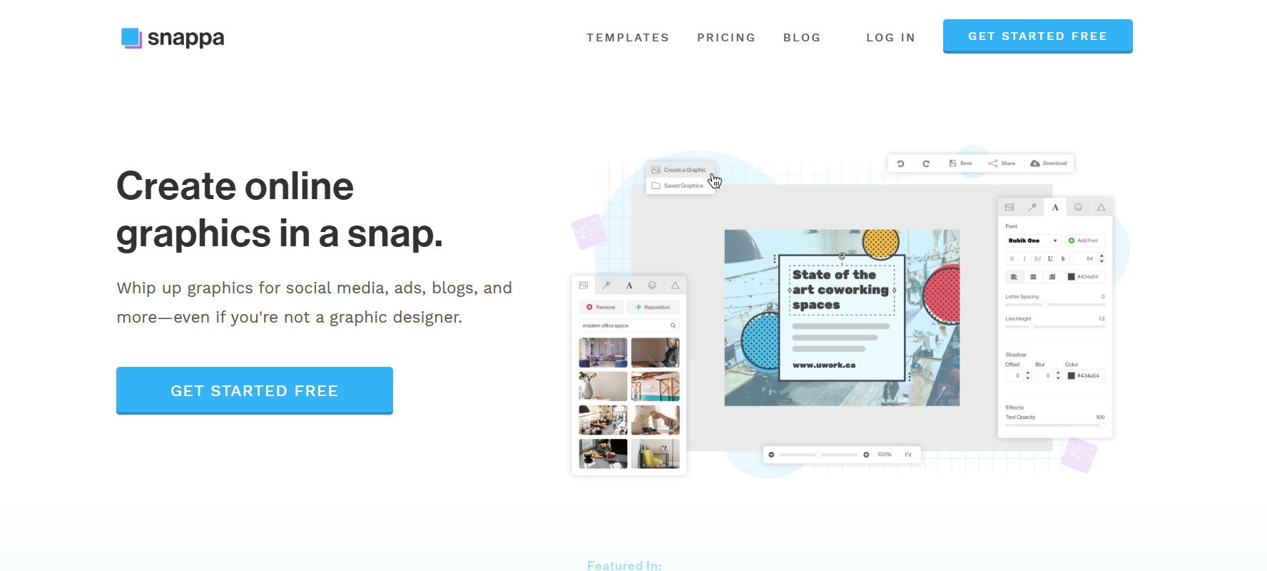
Snappa was founded in 2015 specifically around making online graphic creation faster for small businesses and people without professional design skills. Its users create social graphics, ads, blog visuals, and other marketing assets.
That makes it a better fit for lightweight marketing infographics than complex data storytelling. A marketer who occasionally needs a visual list, simple comparison, or infographic-style promotional asset may value Snappa's straightforward workflow more than specialist visualization capabilities.
Its appeal is therefore context rather than depth. When infographics are one small part of a much larger marketing-content workload, a simple multipurpose editor can sometimes be more practical than a specialized data visualization platform.
Choose for the Work After Generation
A strong first draft can save time, but it's what happens next that separates the best infographic generators from the rest. The right tool should make it easy to refine information, correct the AI's choices, and adapt the visual for its final destination.
Whether you prioritize data visualization, interactivity, templates, or AI-assisted creation, choose a generator based on the workflow you actually need. The best result is the infographic you can confidently publish.