Table of Contents:
Create Images For Social Media: 14 Top Tools & Resources

Table of Contents:
We live in a time where anyone can quickly snap a photo with their phone, edit it with their phone and then immediately post it to thousands of people on social media. So it’s safe to say that simple text-based social media updates just don’t cut it anymore. You need to create images for social media.
Of course, that doesn’t mean you can just post any old graphic and trust the post will take off with likes and comments. You need eye-catching, on-brand scroll-stopping social media graphics. This is no problem for big companies with huge art departments or even companies with just one graphic designer.
But what’s a busy solo business owner to do when they are already doing, well, everything else in their business? First, get yourself educated on a few simple but powerful design tips and the tools to create social media graphics that will transform your social media.
How to create images for social media that WOW your audience
You need to find the tools that will make it even easier to create those stunning create social media images. Here are 14 of our favorites at MeetEdgar.
1. Canva

Canva is an ideal start-to-finish graphic design tool that is perfect for non-designers. It’s a drag and drop tool that offers hundreds of templates, fonts, and images. One of our favorite features of Canva is you can resize any image with just the click of a button, making it easy to resize and create social media graphics for each platform.Price: Free tier and paid plans start at $9.95/month
2. Easil
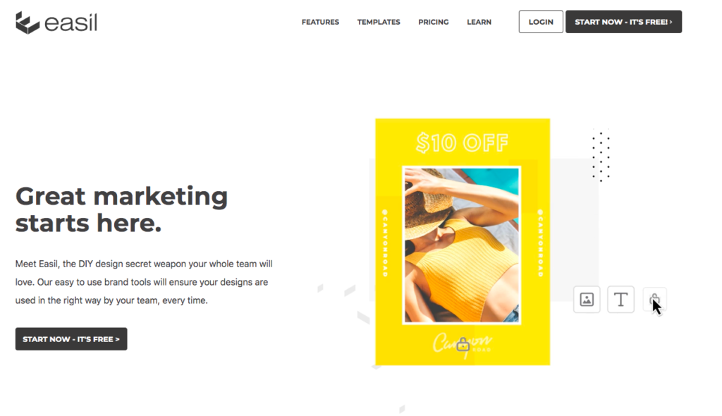
Easil is similar to Canva as it’s a drag and drop tool that makes it easy to make social media graphics from start-to-finish. Easil offers its own library of templates, fonts, and graphics. You can even save your brand kit and favorite designs for quick access. Easil is also fantastic for micro-businesses or anyone who works with contractors as they offer various team tools.Price: Free tier and paid plans start at $7.50/month
3. Crello

Crello is much like Canva and Easil. However, not only can you create graphics for social media, but Crello also makes it easy to create animations. Crello has thousands of animation templates and animated objects to give your social media graphics an extra pop of excitement.Price: Free tier and paid plans start at $7.99/month[sc name="ad1"]
4. Snappa
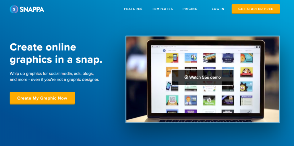
Snappa is another drag and drop tool but it is especially useful for creating image-based text to create quote graphics or promotional graphics. You can upload your own image or one of Snappa’s, edit it then add text, vectors, or effects to the photo.Price: Free tier and paid plans starting at $10/month
5. Infogram
infogram.com

If you are looking for an easy way to create infographics, Infogram is perfect for you! This tool is ideal if you have a lot of data and want to showcase it in a visual way for your website, blog, social media, or presentation. You can simply choose a template and drop in your data to create a custom infographic or presentation.Price: Free tier and paid plans start at $19.99/month
6. Over

If you are mainly creating images for Instagram or on mobile, then you need Over. With the Over app, you can quickly brighten or edit photos on your phone.
You can add fonts, colors, and layers to your images. Over also has a library of videos and graphics you can use to create images or videos - great if you want to find a free social media image! Over is available for iOS and Android.
Price: Free with in-app purchases available.
7. Unfold
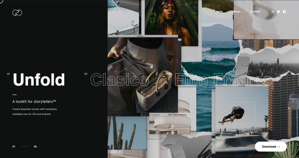
If you want beautiful stories, then you must turn to Unfold. Unfold has hundreds of free social media graphics designed especially for Instagram and Facebook stories.
You can add your own images into the templates and then add text and stickers on top. You can do all of all this from inside of the app so you can create beautiful stories from anywhere.
Price: Free with in-app purchases available.
8. Wavve

Wavve doesn’t create social media images but they do create fantastic audiograms that are perfect for social media and are much prettier than adding a link to a SoundCloud or audio snippet so we included it on the list.
You can upload your own audio or video then add animations, GIFs, text, images or whatever you need to create the perfect audiogram. It’s perfect to showcase snippets of a podcast, music track or interview.
Price: Free tier with paid plans starting a $10/month
9. Logo Maker
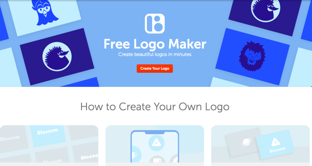
If you need a logo design to brand your social media image or are looking for some logo inspiration, check out Namecheap’s free logo maker. Choose a design, icon, and colors and you’ll instantly have a professional-looking logo!
Price: Free
10. PlaceIt
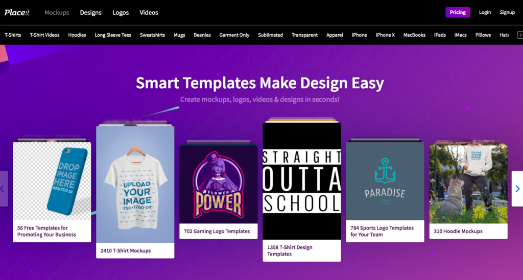
If you need something for a mock-up with your custom graphics or logo, check out Placeit. You can create mock-up images of apparel, books, Facebook images, phones, computers and more!
Upload your logo or custom art, browse through their library and upload your image onto the image you like and have a gorgeous mockup without needing a photoshoot!
Price: $14.95/month
11. GIPHY
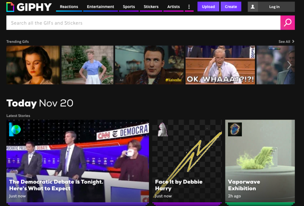
What’s a fun social media presence without a few GIFs? Giphy has the largest library of GIFs you can use for your blogs, emails and social media pages. You can even create your own channel and create your own custom GIFs to use!
Price: Free
12. Creative Market
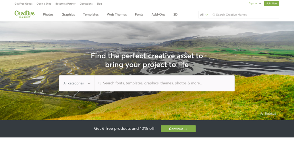
Creative Market is a marketplace for designers, artists, and creators. Browse through and shop for fonts, photos, graphics, templates, and anything you need to create gorgeous graphics or design for your social media pages!
Prices: Prices vary by product
13. Unsplash

Unsplash is a free stock photo website. Photographers, artists, and creators add to this growing library of free stock photos. It’s perfect if you need to find free images to use on Facebook, Instagram, Twitter or your website. It’s really important you don’t use images online without permission as you could end up with a lawsuit and a massive fine. Unsplash is a perfect way to avoid this as all their images are public domain images.
While not mandatory, try to credit photographers when you share their images! Unsplash makes it easy when you download your image to copy and paste the credit.
Price: Free
14. Adobe Color
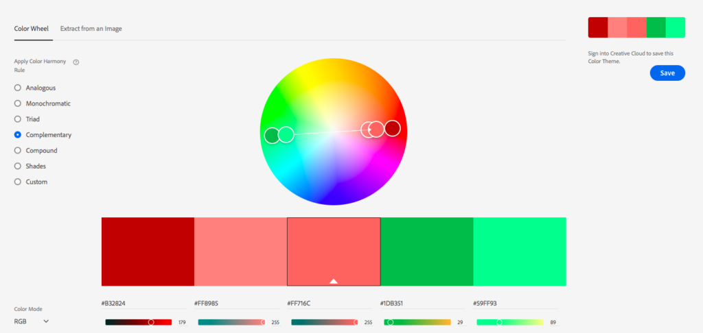
If you are creating your own images or color schemes, use Adobe’s trusty color palette tool to find the perfect color schemes for your project. You can also upload a photo to identify the colors and color schemes within the photo. If you are an Adobe user, you can sign in with your Adobe credentials and save your color palettes to use in future Adobe projects.
Price: Free
Use Images with Creative Commons Licenses
Haven’t found what you’re looking for in any of the above resources? Not to worry: you can continue your search by looking for images that have Creative Commons licenses. A Creative Commons license is essentially permission from the owner of the image to use it for free. Isn’t that just so nice of people?
There are different versions of the Creative Commons license; you can read all about them here. I suggest looking for images that only require to attribute the image to the owner(s) in some way and are free to use for commercial purposes.
Here’s how to find images with Creative Commons Licenses:
- Head over to search.creativecommons.org.
- Insert a keyword for the kind of image you’re looking for.
- Make sure you check the box that says “use for commercial purposes;” it’s a good idea to also check the other box, “modify, adapt, or build upon” in case you want to add your logo, some text or anything else to the image.
- Choose where you’d like to search (like Flickr or Google Images). Once you click on one of these options, you’ll automatically be taken to the results.
- >Select an image you like and then look very carefully for the information regarding copyright, Creative Commons, license, and/or attribution. If you can’t meet the requirements of the owner, do not use the image. If you aren’t sure if you meet the requirements, email them to ask.
IMPORTANT NOTE: Do NOT confuse your company’s blog with a noncommercial blog. Many people think that because they don’t directly make money off their blog, they’re free to fill it with images that have licenses restricting their use for “noncommercial” purposes. This is an extremely grey area, but if your blog has any link to your sales page or to another site that has your sales page (or anything encouraging people to give you money in some way – yes that includes a “Work With Me” link), in my eyes that makes your blog commercial.
Don’t risk getting slapped with a fine just because people can read your blog for free – it’s still a piece of your marketing.In the case of a license that requires you to attribute the source, read to see if the owner gives specific instructions on how to make that attribution.
Tips to make your social media graphics stand out
Now you know the tools to create professional social media graphics, here are five basic design elements that will give them that professional polish.
Colors
Rainbows are beautiful after rainstorms and tie-dyed t-shirts are a fun addition to any wardrobe but when it comes to color schemes for your social media graphics, less is more. It’s best to stick to 1-3 primary colors for your graphics.When choosing your colors, consider how you want people to feel when engaging with your content. Colors can evoke emotions so you want to choose a color that matches how you want viewers to feel.You can dive deep into the nitty-gritty of color psychology here but here’s a brief overview:
- Red - Excitement, energy, power
- Orange - Creativity, determination, enthusiasm
- Yellow - Joy, happiness, cheerfulness
- Green - Nature, growth, health
- Blue - Trust, stability, peace
- Pink - Love, playfulness, vulnerability
You might be tempted to pick the colors you love or that represent the feelings you want your content to evoke. However, there’s something else you need to know about colors.
Opposites attract. In other words, look for contrasting colors. Contrasting colors, otherwise known as complementary colors are colors that appear in different sections of the color wheel.

The original uploader was Sakurambo at English Wikipedia.


Contrasting colors can be used to direct the viewer’s eye toward key information, like keywords or icons. For example, we like to use contrasting colors for call to action buttons.

Fonts
You might love the fancy script fonts and we do too but we caution you on overusing these fonts. You have to balance readability and style. The point of including text is for your audience to read and communicate that information. Script or stylized fonts are often harder to read, especially when a user is quickly scrolling or reading on a smaller screen on their mobile device.
If you are communicating something short and sweet, like a headline, we recommend using a larger, sans serif font. But if you are creating a larger graphic, you can balance different fonts by putting the headline in a stylized font and using a sans serif font for the smaller body copy.

Much like using colors, less is more with fonts. Don’t overwhelm your image and stick to a maximum of two fonts in each design.
Hierarchy
When designing, ask yourself: “What is the most important part of this graphic?”
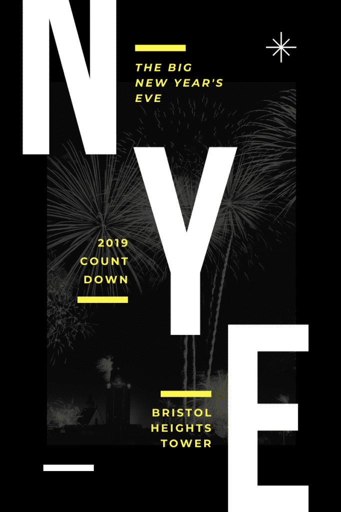
Our eyes are drawn to the largest elements on a page. This is known as a hierarchy. You can easily use this in your designs by putting the most important information in the big, bold font or applying a pop of color to the most important part of the design. You can see in this example below that in this advertisement for New Year's Eve highlights NYE so viewers immediately know that it's a New Year's Eve celebration.
White Space
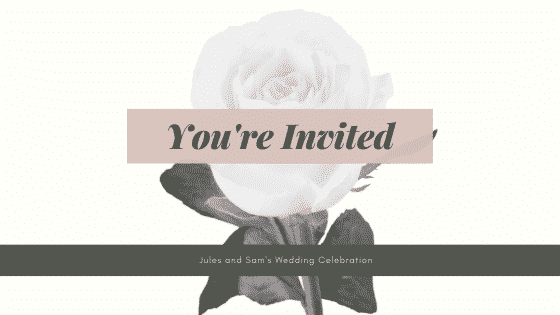
It’s normal for anyone to feel anxiety when stuck in an overcrowded space. The same rule applies to design. Crowded designs are out and whitespace is in. If a design isn’t doing what you want, experiment with deleting extra elements and adding in white space around the text, images or other elements. You can also try scaling down elements like images or fonts to create more whitespace. This will make your design easier to read and it’s more likely to be eye-catching than an overcrowded graphic.
The Rule of Thirds
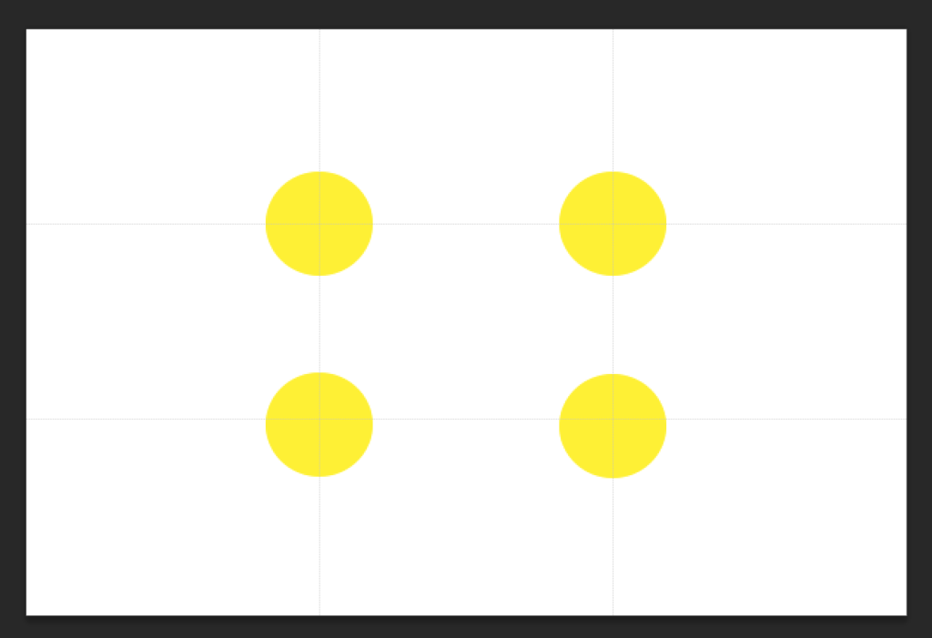
If you struggle with balancing your design, the rule of thirds can help. The rule of thirds simply means dividing your design into three rows and three columns. The intersection of the lines make the focal points of your design. This doesn’t mean you have to place important elements in each of these focal points but it makes it easier for you to visualize how you want to structure your design. The rule of thirds acts as a guideline for composing your design.
These 5 design elements can help you design any graphics for your business, not just your social media graphics! But, we wanted to add some specific tips for your social media that will help you save time and create more effective graphics. Because you know we’re all about getting more done in less time over here at Edgar.
Categorize your content and create image templates for each category
We advise using a category-based content system to manage your social media (And if you’re new, you can read more about that here.) Then once you have your categories, you can create templates for each category. For example, we have different templates for “Questions,” “Quotes,” and “Blog Posts.” This way, we can easily drop in the new content into the template and we’re keeping our visuals consistent without feeling repetitive.
Create a visual brand identity cheatsheet
Three little words should guide you in your social media graphic designs: Keep it simple. To eliminate any overwhelm, get clear on your visual identity and then only incorporate those elements. Here are a few ideas of what you can include in your visual brand identity cheatsheet:
- Brand Colors - Try to have 1-2 main colors and 2-3 complementary colors and at least 1 accent color.
- Fonts - Stick to no more than 3 with one for your headers, one for your sub-headers and one for your body copy.
- Image styles - For example, do you use images of people or nature? Do your images use a certain filter or color scheme.
- Iconography - If you use icons, stick to one there a certain illustration style and stay consistent.
Know your goals
One of our favorite rules here at MeetEdgar is to give every piece of content a job to do. The rule applies for visual content. Ask yourself what you want your social media graphics to do.
- Are they for conversions, website traffic, engagement?
- Who is the audience for these graphics?
- What platforms do they love?
- What device do they use to check social media?
- What emotions do you want your audience feeling?
In short, do your homework first, then come back to design. Trust us, it will make a difference. And when in doubt, use one of these tools and resources for social media graphics to help you!
Start creating professional graphics for social media
As you can see, making gorgeous social media images is much easier when you have the right tools and design intel! These are just a few of our favorite tools for creating incredible social media graphics but we know there are many more.
So we want to hear from you! What are your favorite tools? Let us know in the comments section.
Subscribe to our newsletter
Are you ready to automate your socials?
Say goodbye to manual scheduling and hello to effortless automation.


