Table of Contents:
The Unboring Guide to What Your Social Media Statistics Actually Mean

Table of Contents:
You wander into the kitchen and open the fridge. You’re looking for something, but you’re not sure what - and when nothing really jumps out at you after about 10 seconds of staring, you give up, close the door, and head back to the couch.How unsatisfying.
The thing is, that’s exactly what can happen when you look at your social media data! You click over to your Twitter analytics, see a bunch of charts and numbers and data that has almost NO context, scroll up and down a little bit, and close the tab, frustrated.
Because when you’re not sure what you’re looking for - or the best way to find it - it’s way too easy to just walk away, nothing gained, nothing lost.But wouldn’t you rather know? What if you could find out what’s working and what’s not? (Spoiler alert: You can.)
We put together a guide that would help you determine some of the best times to post on social media, and now it’s time to put your work to the test. What do your fans and followers like? What don’t they like? Are you really posting the right updates at the right times, or do you need to adjust your schedule? Time to find out!
First up: X (formerly Twitter)
The good news is, Twitter provides you with all kinds of awesome performance data that you can download into a spreadsheet.
The bad news is, you’re still working with a spreadsheet.(Cue groans.)So let’s make this as painless as possible - here’s how to cut through the boring stuff and get to the information you REALLY want,.
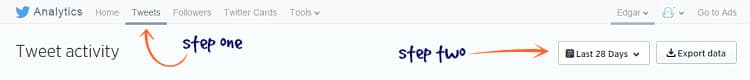
- Go into your Twitter analytics and click on the Tweets tab at the top of the page.
- Use the drop-down to choose a date range for the data you want. (You want a decent amount of data to work with - at least several months’ worth.) Click the Export data button to download everything as a CSV, which you can open in a program like Excel or upload as a Google Sheet.
- The top row of your sheet is just labels for the data below - impressions, engagements, and so on. You want that row to stay put at the top, so freeze it in place. (In Google Sheets, for example, highlight the row, then click “View” and “Freeze Rows.”)
- When you downloaded this data, Twitter also included all of your @-replies - make your life easier by deleting them now, so they aren’t in the way when you’re trying to read the data for your original tweets. Highlight your Tweet text column and sort it A-Z so that every tweet starting with an @-symbol is grouped together, then delete those rows in one fell swoop.
Now you’re ready to really start analyzing your performance.Remember, the data most valuable to you is going to be your impressions, engagement, and engagement rate - here’s a refresher on what those terms mean. While it’s useful to look at all three, we’ll use engagement rate as an example. (That’s the ratio of engagement, or clicks/retweets/etc., to impressions, or number of people who saw the tweet.)

Highlight your engagement rate column, and use it to sort your sheet in descending order. This allows you to organize your tweets according to which had the best overall engagement rates - and that means you can look for patterns.What do you notice about your most-engaged tweets? Look for things like:
- Are most of them posted in the morning? Afternoon? Evening?
- What types of tweets are most popular? (Links to your blog? Questions for your followers?)
- Do any tweets show up more than once? (This only applies if you post the same tweet more than once, of course.)
You can do the same for your least-engaged tweets, too. (You may find, for example, that your followers aren’t particularly interested in clicking through to blog posts at certain times of day, or that questions tend to go unanswered at others.)That’s just one example - and engagement rate isn’t necessarily the only thing that matters. If what you want to focus on right now is visibility, and just being seen by as many followers as possible, try sorting your sheet according to the impressions column. This may help you determine the best times for posting updates for which you want a big audience.

Feeling overwhelmed by data? Use conditional formatting to add visual clues that are easier to process.
Here’s an example. Say we want to determine when we get more impressions - in the morning, or in the afternoon/evening.
After sorting our impressions column in descending order, we can highlight the entire column and add conditional formatting. (This is when we tell the spreadsheet to format cells depending on the data inside them. Here, you’ll see - it’s actually really easy.)We highlighted the entire impressions column, then went to “Format” and “Conditional formatting.” (This is in Google Sheets - your program may vary.) That brings up this box:
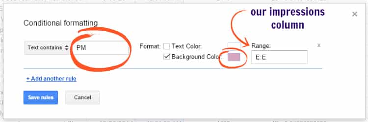
We set it up so that the spreadsheet would find any cell in that column with “PM” in it, and give that cell a pink background. (And that’s just one option! Another example would be for the spreadsheet to find any cell with a number above or below a certain benchmark in it - perfect if you’re trying to see how tweets posted before/after a certain time of day perform.)After clicking the “save rules” button, our sheet looks like this:
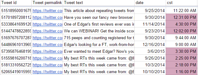
This is only about 3% of the tweets in this sheet - not nearly enough to draw any conclusions, but enough to show how conditional formatting works. As we scroll down through the sheet, it’s much easier for our eyes to detect patterns in color than to try reading every individual cell!
Now give yourself a big pat on the back - you totally did it. You’ve conquered the Twitter spreadsheet, determined what’s working and what’s not, and now you can use that data to retool your posting schedule.So take a breather, stretch your legs, hydrate - whatever you’ve gotta do, because now, it’s time to tackle Facebook.
Diving into your Facebook Insights
Fortunately, reading your Facebook Insights is a lot like reading your Twitter analytics - particularly because Facebook also allows you to export your data as a spreadsheet. (This blog post has a refresher on the data you can find inside Insights without exporting.)At the top right of your Insights page, you’ll see the “Export” button, which opens a window that looks like this:
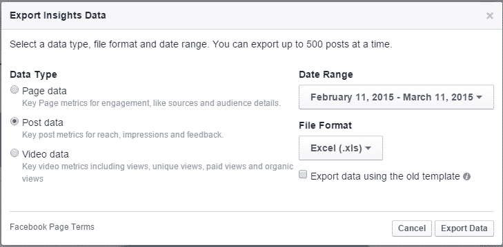
Now, if you want to see which of your posts are getting the best reach, select the “Post data” option and adjust the date range for whatever amount of information you want. Export the data, and boom - you’ve got yourself another spreadsheet.
Follow the same steps you used to organize your Twitter spreadsheet. (Hint: To organize by reach, you want the column labeled Lifetime post total reach. Don’t forget to freeze the top two rows in place before you start sorting!)Just like you did for Twitter, you want to look for patterns in which posts got the best reach.
Here’s a perfect example: We sorted our posts in descending order according to reach, then used conditional formatting to color-block the ones posted in the afternoon/evening. (You just knew conditional formatting was going to show up again, right?)Here’s what we saw:

That represents the top 10% of this sheet - the 10% of posts that got the highest reach. The conditional formatting makes it easy for us to notice a distinct pattern: 2/3 of our posts with the highest reach were posted in the afternoon/evening, while only 1/3 were posted in the morning.
You can even go deeper than that, if you like - for example, of the pink-highlighted posts, 2/3 were posted in the early afternoon, while only 1/3 were posted later than 2:30 pm. (This sample may not be large enough to draw a super sound conclusion, but it’s enough to make us think that posting at the end of the work day isn’t necessarily as valuable as posting in the after-lunch lull.)
What about which TYPES of post get the best reach?
Facebook’s algorithms that determine post reach are highly secretive and hard to predict. (We keep track of which types of posts they reward and which they discourage on our algorithm timeline.)
Fortunately, though, you can use your spreadsheet to get a look at which types of post are (and aren’t) giving you the best reach. For example:
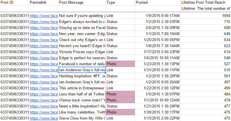
We used conditional formatting to highlight posts with the word “Photo” in the Type column, and this is what we saw. Of our posts in the top 10% for reach, less than 1/4 were photo posts - not only does this put some of the data we collected back in January into perspective, but it may also represent the results of an algorithm update Facebook announced back in autumn 2014. And this is just one way to organize your sheet.
For example, you can also sort your data according to which posts got the most likes, comments, shares, or clicks - whatever it is you want to measure. (They’re all valuable, depending on your priorities. For example, if you regularly ask questions on Facebook at certain times, but those updates aren’t ranking high for comments, you might consider adjusting your schedule, and/or asking different questions.)
Now you’re ready to start digging into your OWN analytics!
Once you practice this on your own and get the hang of it, it’s surprisingly easy to sort through all the data and find the stuff that’s really valuable.
Just remember - everyone’s best times to post are different, so the only data that can help you is your own!

Subscribe to our newsletter
Are you ready to automate your socials?
Say goodbye to manual scheduling and hello to effortless automation.
