Table of Contents:
5X Your Lead Gen: Why 98% of Your Visitors Never Convert (And How To Change That)

Table of Contents:
It’s one thing to attract website visitors. It’s another to convince them to convert.
That’s why so many business owners and marketers look at their stats - such as web traffic versus converted leads - and shake their heads over the disparity.
If your traffic isn’t converting, you have to figure out why.
Maybe you’re not giving them the offers they really want, or perhaps you’re bombarding them with too much information at once. Annoying popups, distracting visuals, unclear calls to action, and weak value propositions can all thwart your lead generation efforts.Let’s look at a few reasons why your lead gen efforts aren’t working - and how you can reclaim some of the 98% of visitors who aren’t converting.
Why your visitors leave without converting
Lead gen is all about optimizing the user experience (UX). You want people to get immersed in your website from the moment they arrive, spend as much time as possible exploring your site, and convert on a compelling offer.
You can’t be greedy, though.If you’re flashing popups at people left and right, they’ll get annoyed and leave. If someone has just stumbled on your website by chance, they’re nowhere near ready to convert.
If you’ve ever discovered a website that looks like this, you know what I’m talking about:
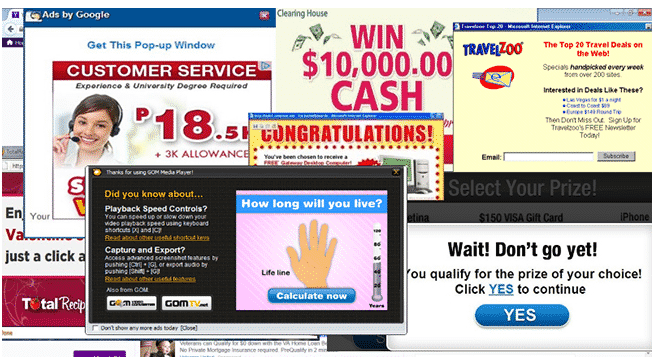
The customer doesn’t know where to look, or how to clear all those popups.
Pare down your web design and popups so they’re neither distracting nor annoying. Then figure out what type of offer would convince users to convert.
Maybe you’re offering a lead magnet like an ebook or audio file that your users just don’t want. Try another offer, such as a discount code or free toolkit. A/B test them to figure out which causes more visitors to convert.But don’t forget other aspects of user experience:
- Avoid forcing visitors to fill in more form fields than absolutely necessary.
- Don’t use more than one CTA offer on any given page.
- Remove distracting elements, such as navigation bars, from landing pages.
- Provide value before you ask for something in return.
Knowing what you shouldn’t do can help you avoid mistakes, but what should you do?
Provide an amazing user experience
UX is severely misunderstood.
Many marketers think it’s all about making a pretty website. That’s part of it, but an attractive screen won’t improve lead gen by any significant amount.
Instead, UX requires you to consider the entire flow through your website. How do visitors get from one page to another? What are they looking for? What do they expect?
Think about your conversion funnel. If a visitor lands on your blog post about how to choose a washing machine, they’re not ready to buy a washing machine – they’re at the top of the funnel.
You might offer a lead magnet like a detailed comparison checklist for them to download. Add the CTA to the end of your blog post and add an exit intent popup with the same offer.
On the other hand, if your visitor arrives from a Facebook post about a discount on washing machines, you’re dealing with someone at the bottom of the funnel. Give them every reason to convert by streamlining the checkout process. Again, you can use exit popups to steer people back as they leave. Since UX plays such a central role in conversions, businesses also need to carefully evaluate external partners. Learning how to choose the right web design agency can ensure the website not only looks appealing but also functions seamlessly to support the entire user journey.
Use exit popups to 5x your lead gen
Exit popups are extremely useful, but they can also go horribly wrong. Even the prettiest popup won’t help lead gen if it doesn’t come at the right time.
That’s why you need targeted popups on specific pages on your website. Again, go back to the conversion funnel. A typical exit popup looks a lot like this:
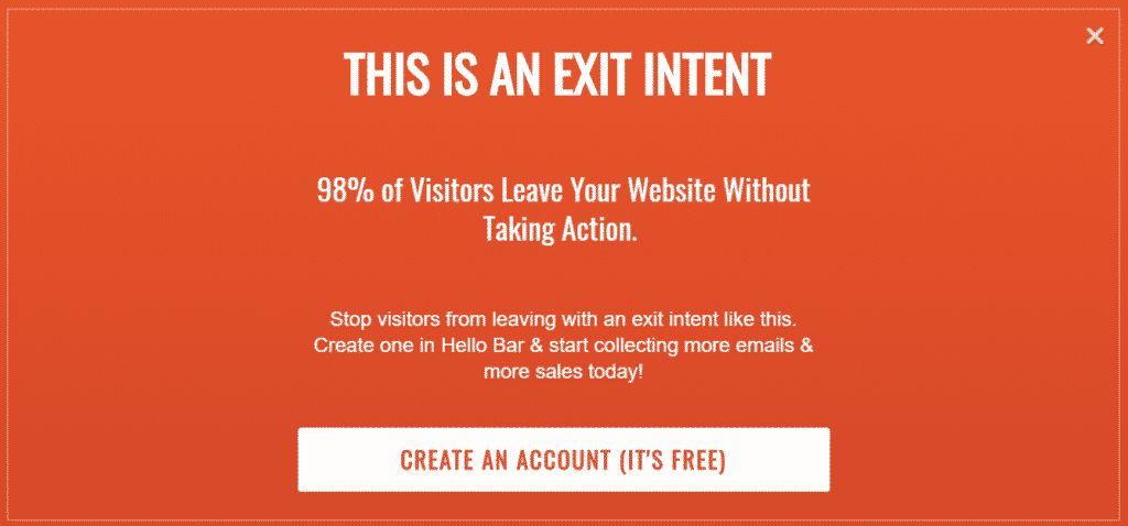
An exit popup appears on your web visitors’ screens when they attempt to click away and leave your site. It's your way of saying, “Wait a minute! Before you go…”But you have to fill in that sentence.You could offer a discount on your most popular product, or you could provide a free download that offers legitimate value to the visitor.
Brainstorm a few ideas:
- Wait a minute! Before you go...Take advantage of this $10 off coupon!
- Wait a minute! Before you go...Would you like to download our free guide on [topic] for free?
- Wait a minute! Before you go...Sign up for our email list to receive monthly discounts!
You don’t actually have to use the, “Wait a minute! Before you go…” construction. Just make it clear that you’re offering something of value in case the visitor wants to stick around.
Believe it or not, using exit popups for your site could increase your lead generation by five times or more as long as you’re adding to the user experience with genuine value.
Still, exit popups often fail because they lack two essential qualities: visual interest and genuine value.
Think about it. You’re shopping at a brick-and-mortar store. Maybe you’re looking for something in particular, or perhaps you’re just browsing.
Whatever the case, you don’t see anything you can’t live without, so you head for the exit.
A sales associate flags you down and says, “Hey, wait, don’t you want to look around some more? I’m sure you can find something to buy!”What’s your response to that?
And what if that same sales associate flagged you down and said, “Hey, just in case you didn’t know, we’re running a half-off sale on [something you want/need]. If you’re interested, I can show you.
”Your response might be a little different in that scenario.
Let’s go back to the digital world, though. Someone has visited your website, glanced around, and decided to head for the exit. This is your chance to reel them back in.So you design an offer:
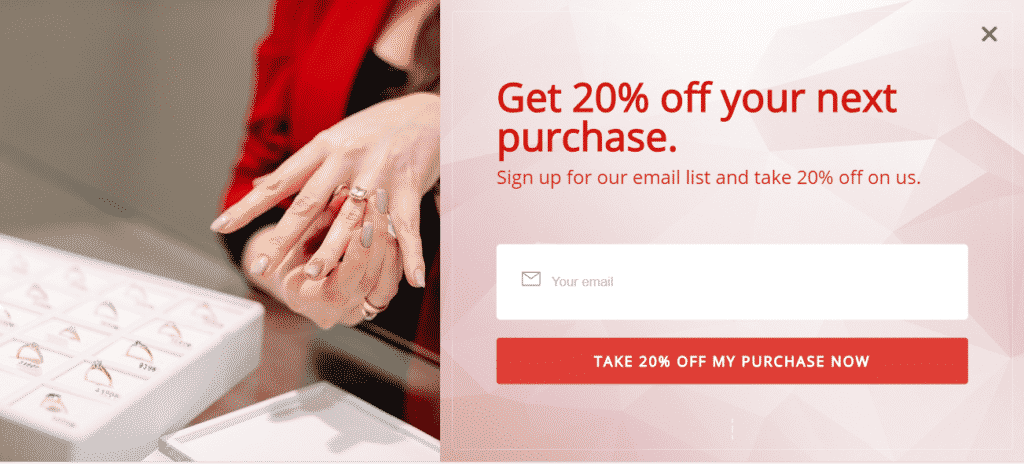
That’s a pretty good deal, right? If your prospect was considering a product and decided it was too expensive, he or she might go back and purchase it with that shiny new discount.
Plus, you’ll have a new subscriber to whom you can market in the future. With a targeting feature like the popup software Hello Bar has, for example, you can show custom messages to repeat visitors.
Use interaction to increase immersion
Conversations are really important when it comes to marketing.
Think about your social media activity, for instance. Findings on predictive AI lead-generation strategies suggest automated chat prompts can replicate that relational trust at scale.
You know that if someone leaves a comment on your latest Facebook post, adding a response can increase trust and build relationships.
You can’t have hour-long conversations with everyone, though – and visitors to your site don't always want to take that first step. That’s why you have to start and simulate conversations on your website if you want to improve lead generation.
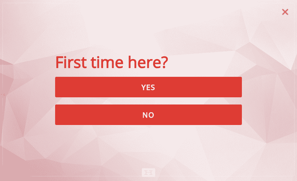
Let’s go back to the exit intent popup we showed before. It offered the visitor a 20% discount in exchange for his or her email address.
But it might be better to start the conversation with something a little more friendly. With a lead generation software like Hello Bar, for example, you can add questions to your exit intent, which will warm up the visitor and simulate a back-and-forth conversation.
It might look something like this:
Or you could ask a question that has more to do with your industry or niche:
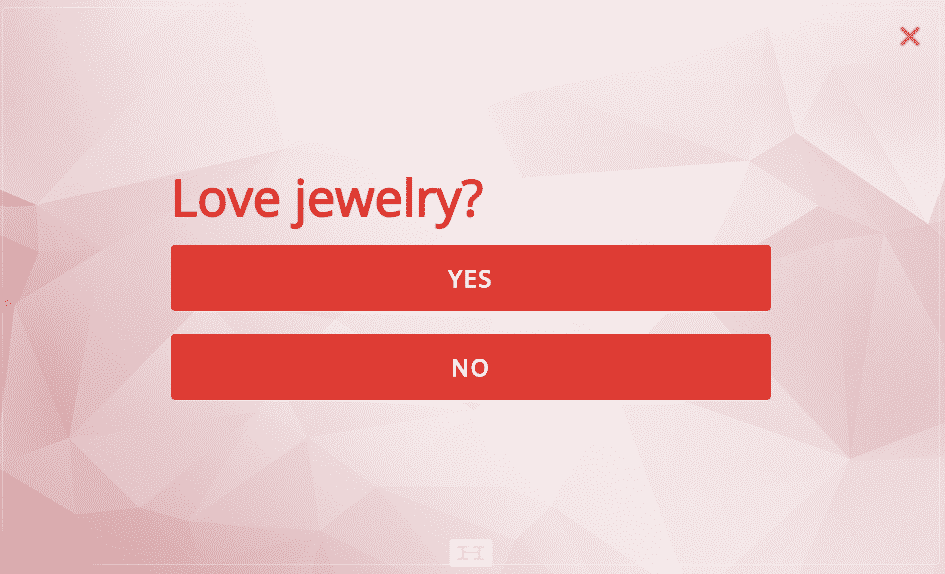
Whatever the case, it gives the visitor every chance to say, “Yes.” Subsequently, it becomes easier to give the same response to whatever you ask next.
Examples of offers that work
I mentioned that 98% of your website visitors are leaving without engaging. That’s a pretty strong number.
We used that statistic on the Hello Bar website in an exit popup to encourage people to sign up for our email list. In just one week, we got 450 additional signups.
Numbers are powerful because they allow you to provide evidence of what your product or service can do, pick at your prospective customers’ pain points, and foster trust between you and the visitor.
Let’s say you sell a weight-loss product. You want to not only establish credibility, but also to remind your website visitors of their goals.
You could use a statistic about long-term weight loss in an exit popup:
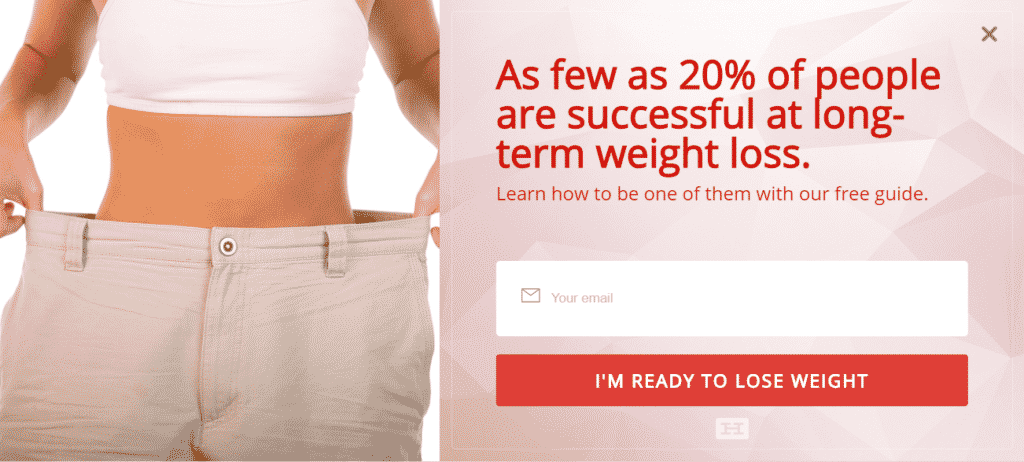
If your visitor wants to lose weight, that statistic will capture immediate attention and hit a familiar pain point.
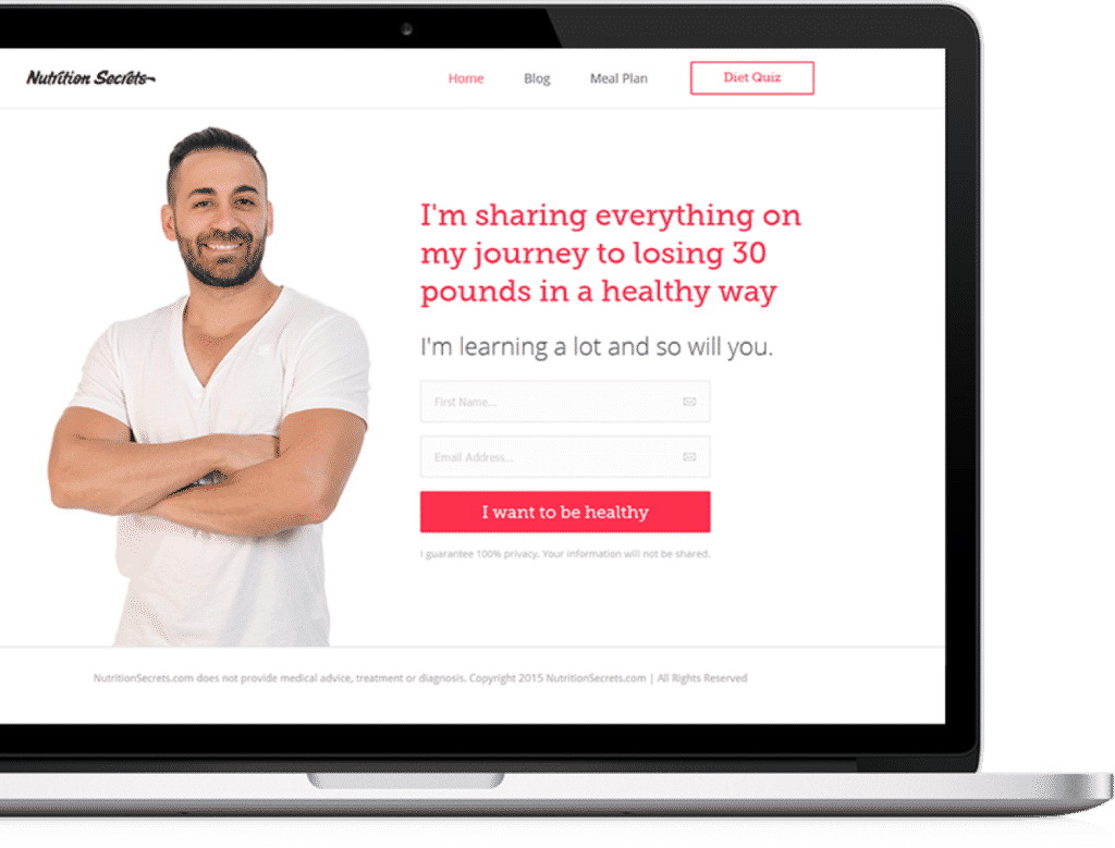
You might be familiar with business partners Neil Patel and Mike Kamo. They launched a site called Nutrition Secrets and started collecting email signups.
When they deployed an exit intent popup, email collection shot from 10 per day to 50 per day.
Exit popups aren’t your only resource when it comes to snagging leads who might otherwise bounce. Top bars, for example, stay at the top of the visitor’s screen so he or she doesn’t lose the signup page.
Think about it. You land on a landing page, then something else catches your eye. Suddenly, you can’t find it again - and you’re not going to waste half an hour looking for it.
That’s how consumers think, so you have to make signing up easier for them.
Create a handy top bar that invites visitors to become leads:

No matter how many internal links your visitors follow, they can still easily opt in to your email list without having to hunt for a signup form.
Conclusion
Lead generation isn’t just about building a landing page and crossing your fingers. You need strategies and tools to convince people to convert.
Exit popups and top bars offer the ideal strategy. Carry on conversations with your consumers even when you’re not around. Offer discounts, lead magnets, and other incentives to gain the advantage.
Want to try these strategies on your own? From awesome exit popups to top bars, you can use this referral link to try Hello Bar free for 30 days. It’s on us!
What’s been your own experience with exit intent popups? Ever put one on your own site? Let us know how it's gone in the comments!

Hello Bar's Director of Marketing, Lindsey Morando, has 15+ years of marketing and business development experience that spans multiple industries including health & wellness, SaaS, lifestyle and hospitality. No matter which industry she is focusing on, Lindsey prides herself on the creation and implementation of engaging grassroots and online marketing tactics that convert fans into paying, happy customers.

Subscribe to our newsletter
Are you ready to automate your socials?
Say goodbye to manual scheduling and hello to effortless automation.
